
Testing responsive websites is a laborious task. Until now, implementing a stable and maintainable automated solution for cross-browser and cross-device testing of a responsive layout has been nearly impossible. But what if we had an opportunity to write visual tests for responsive websites? What if we could describe the look and feel of an application and put this directly into our tests?
Upon considering this question, I decided to also look at another interesting side of visual testing. For quite a long time I have been a fan of the test-driven development (TDD) methodology. It helps me in my daily programming work. TDD enables me to formalize the task and to make sure everything is implemented according to the requirements.
More importantly, it helps me catch a lot of bugs before they go live. For the last seven years, my main focus has been testing automation for a big enterprise project. Over time, I became obsessed with the idea of applying automated testing using the TDD methodology to the look and feel of responsive websites. After years of research, I came up with the Galen Framework — a tool and a special language for visual testing. This has been running for a while, and once the language became mature enough, I decided to perform an experiment with visual test-driven development.

In this article, I’ll describe this experiment in detail and propose TDD as a methodology for front-end development. We will look at the new visual testing technique and examine how to get the most out of it.
Introduction To Galen Framework
Though a new technology, Galen Framework has already been used by some big companies, such as eBay, SkyScanner, Gumtree and Bestseller.nl, and it was also used to test the Washington Post’s website. Besides enterprise companies, it is also used in web studios, such as ADCI Solutions. The framework is open-source and hosted on GitHub, so anyone can participate in the project and contribute to the code.
The fundamental testing concept in Galen Framework centers on checking the location and size of all page elements relative to each other. This way, you can describe the layout for any browser window’s size and you don’t have to use absolute positioning.
The Galen Specs language was designed to resemble natural English as closely as possible and has been implemented in a semi-Markdown way. So, what does it look like? Well, imagine that you want to check that a “Login” button is located next to a “Cancel” button and has a 10-pixel margin from the right side and that they are aligned horizontally. We can transform that statement into Galen Specs:
login-button
  near: cancel-button 10px right
  aligned horizontally all: cancel-button
Consider another example. What if we want to check that a logo should be located inside the header in the top-left corner, with approximately a 20-pixel margin? Here is how you do it:
logo
  inside: header 17 to 22px top left
We can even use a shortcut:
logo
  inside: header ~ 20 px top left
A lot of other check types exist, and all of them are described in detail in the official documentation. The learning curve is not very steep. The structure of Galen Specs is pretty simple, and once you understand it, testing becomes easy. We’ll get back to the experiment I mentioned at the beginning in a moment, but first let me give you a bit of insight into TDD as a whole.
Test-Driven Development
TDD has been used for quite a long time and has proven itself to be a strong methodology for building solid applications. In the beginning, you might feel like you are wasting time writing tests, but you will spend much less time later on finding the root causes of problems. More importantly, you can concentrate on small units of code and make sure each unit is of good quality. The numbers of tests will grow with the main code, and essentially, you’ll get early feedback on any problems in your application.
A Concept Of Visual Test-Driven Development
So, how do we approach TDD for HTML and CSS? Obviously, it is a bit different from traditional TDD, where tests are implemented in a white box. That is why I added the word “visual” to it, as with the Galen Framework: We are testing how a website is rendered in the browser, and we don’t particularly care about its internal structure. So, it sounds more like black-box or gray-box testing. In this article, I will show you how to build a responsive web page by writing the layout tests first before we even have any page. One thing to keep in mind is that our tests will also serve as a source of documentation, explaining how the page should look on any device. With all this in mind, let’s clarify the process.
- Design and test Imagine how the page should look. Write a sketch, write a test.
- Code Implement the HTML and CSS code, and pass the test.
- Refactor Improve the code and tests.
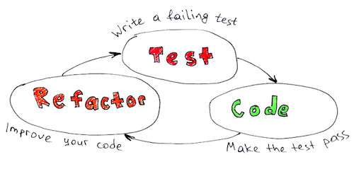
We are going to break down the whole development process into small iterations. Another important rule: For each iteration, we shall implement only the code that is needed for the tests. This way, we’ll make sure that our test coverage is always close to 100% and that we don’t get distracted by things that are not declared in the current iteration. This article is based on the visual TDD experiment from Workshop Shopping Cart. It is a GitHub project, so you can track all of the code changes in it.
The Experiment
Imagine that we have decided to build a shopping-cart page and we want it to be responsive. The page’s functionality is the same as in any online store: Users should be able to review their shopping items, proceed to pay or go back.
Phase 1: Sketched Requirements
We sat down, thinking through all of the details, and we came up with this sketch:
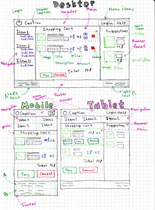
Looks OK for now. As you can see, we have three types of sketches: desktop, tablet and mobile. Now we can start implementing the tests.
Phase 2: Project Configuration
For this tutorial we don’t need any special IDE — any text editor will do. It’s going to be pretty simple. Let’s just create our project folder, shopping-cart, and in it create two folders: website and galen-tests. Of course, configuring a local webserver would be better, so that we can access the page through https://localhost in our tests. But because we have only one page, we can work with plain files for now, accessing them via file:///… URLs.
Download Galen Framework and install it. Galen Framework has installation scripts for Linux and Mac. If you are a Windows user, take a look at “Configuring Galen Framework for Windows.”
Create all of the folders that we discussed above:
shopping-cart/
  |-- website/
  `-- galen-tests/
That’s it for now.
Phase 3.1: Writing Tests
Let’s think of how we can split our work into small iterations. The first thing we would think of is to build a basic page skeleton:
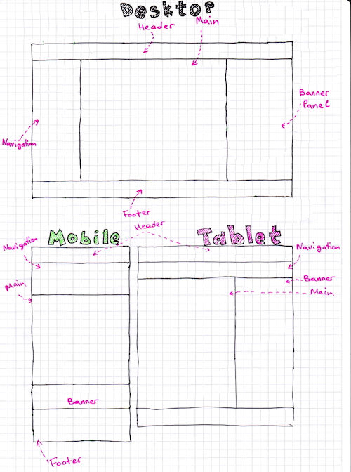
This means that, at the moment, we have only five objects on the page: “Header,” “Main,” “Navigation,” “Banner panel” and “Footer.” Let’s start writing Galen tests for our skeleton. In the folder galen-tests, create another folder named specs. In it, we will keep all Galen Spec files.
Let’s create the first one, galen-tests/specs/shopping-cart.spec, with the following code:
=====================================
header          css #header
navigation      css #navigation
main            css #main-container
banner-panel    css #banner-panel
footer          css #footer
=====================================

@ *
--------------------
header
  inside: screen 0px top left right
  height: 60px

navigation
  inside: screen 0px left
  below: header 0px

footer
  inside: screen 0px bottom left right
  below: banner-panel 0px
  height: 100px

@ desktop
------------------
navigation
  width: 300px
  aligned horizontally all: main
  near: main 0px left

main
  below: header 0px

@ desktop, tablet
-------------------
banner-panel
  below: header 0px
  inside: screen 0px right
  width: 300px
  near: main 0px right
  aligned horizontally all: main

@ tablet
-----------------
navigation
  inside: screen 0px left right
  above: main 0px
  width: 60px

main
  inside: screen 0px left

@ mobile
----------------------
navigation
  inside: screen 0px left right
  above: main 0px
  height: > 60px

main
  inside: screen 0px left right
  above: banner-panel 0px

banner-panel
  inside: screen 0px left right
  height: > 50px
As you can see, we’ve already defined some object locators in the beginning, even though we don’t have any HTML code yet. This might seem a bit weird, but on the other hand it could turn out to be a useful exercise. This way, we’ll have to think over our DOM structure up front, and we can already come up with some good ideas of how our HTML code could be structured. For instance, we already know that in our future page skeleton, we are going to have a element and . The same goes for other page elements. And if for any reason we decide to change the DOM’s structure, we can always update our tests in a single place.
Now, let’s also prepare a test suite that will execute our tests for three sizes: desktop, tablet and mobile. To make it simple, we are going to emulate a mobile or tablet layout by resizing the browser’s window. Create a file named galen-tests/shoppingCart.test and put in the following code:
@@ table devices
  | device    | size     |
  | mobile    | 500x700  |
  | tablet    | 900x600  |
  | desktop   | 1300x700 |

@@ parameterized using devices
Shopping cart on ${device} device
  ${websiteUrl} ${size}
    check specs/shopping-cart.spec --include "${device}"
In the code above, we have declared a devices table containing settings for three screen sizes. Using this table, Galen Framework will invoke our test three times, each time with different device and size parameters. We’ve also defined a placeholder for the website’s URL, via the ${websiteUrl} construction. We are going to provide this parameter later from the command line.
Phase 3.2: Writing Code
Because we have implemented the initial test code, we can start working on the HTML and CSS. For this experiment, I chose Twitter Bootstrap. You might think that Twitter Bootstrap is already well tested and responsive. Well, the point of visual TDD is to come up with solid tests and to build a pixel-perfect website. So, it doesn’t really matter which framework you use to build a website because in the end the only thing that Galen checks is the location of page elements on the screen. I picked Twitter Bootstrap merely to simplify the experiment because it already has some things I need, so I won’t have to waste time reimplementing them. Still, we have strict requirements in our Galen tests for the page skeleton, and we need to deliver a page according to those requirements. Download Twitter Bootstrap, and copy all of its contents into the website folder. There, we should have the following structure:
website/
  |-- css/
  | |-- bootstrap-theme.css
  | |-- bootstrap-theme.min.css
  | |-- bootstrap.css
  | `-- bootstrap.min.css
  |
  |-- fonts/
  `-- js/
    |-- bootstrap.js
    |-- bootstrap.min.js
    `-- npm.js
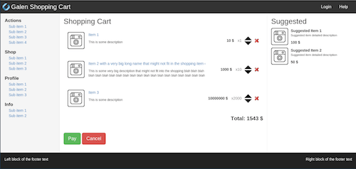
Now, let’s actually write some HTML. Create a file named shopping-cart.html in the website folder with the following code:
    Galen Workshop - Shopping Cart


          Navigation


          Main container


          Banner panel
Create a file named main.css in our website folder with the following contents:
#header {
  background: #2E849E;
  color: white;
  border-radius: 0;
}

#navigation {
  background: #faa;
  height: 100px;
}

#main-container {
  background: #afa;
  height: 100px;
}

#banner-panel {
  background: #aaf;
  height: 100px;
}

#footer {
  color: white;
  background: #222;
  height: 100px
}
That’s it — we’re done with the code! You might want to check whether everything you made is same as in the GitHub repository. Now we can run the tests and check that we’ve done everything well for this iteration.
Phase 3.3: Running Galen Tests
Because I haven’t configured a local web server, I decided to test it directly from my local file system. In my case, if I open this page in a browser, the URL would be file:///home/ishubin/workspace/workshop-shopping-cart/website/shopping-cart.html. So, below is how I am going to pass this URL to our tests:
galen test shoppingcart.test \
-DwebsiteUrl="file:///home/ishubin/workspace/workshop-shopping-cart/website/shopping-cart.html" \
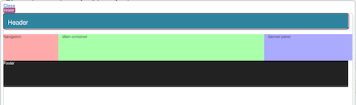
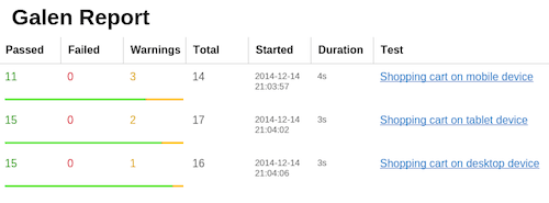
--htmlreport reportsThe command above will launch all of the tests and will generate an HTML report in the folder I’ve specified, reports. If you open the generated reports/report.html file in the browser, you should see this picture:
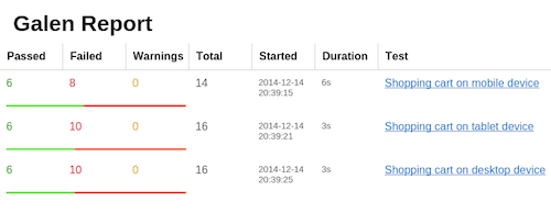
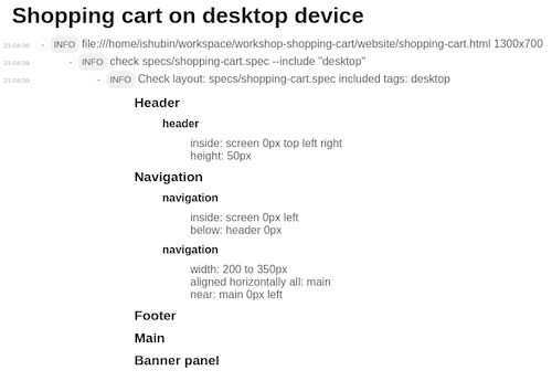
As you can see, we have some failures. If we click the “Shopping cart on desktop device” link, it takes us to a more detailed report.
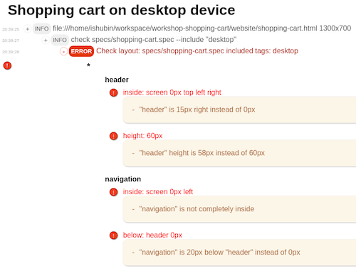
As you can see, the naming of sections isn’t all that pretty. Galen uses tag names by default. We will fix that a bit later. Let’s look at the error messages. There are a lot of them. Let’s just focus on the first failure for now. If you click it, you get a screenshot, highlighting the elements on it.
The error message we got was “Header is 15px right instead of 0px.” What does that mean? Notice the misalignment of the right edges of the header and the banner panel? That’s right. The problem with this page is that the header’s width matches the viewport, but because the middle section is bigger, it is increasing the size of the screen. That also puts scroll bars on our page. And because we initially said to Galen that we want the header to be inside: screen 0px top left right, we meant that there should be no margin from the left and right edges. But there it is, so it is a bug.
Let’s look at another error message, “Navigation is 20px below header instead of 0px.”
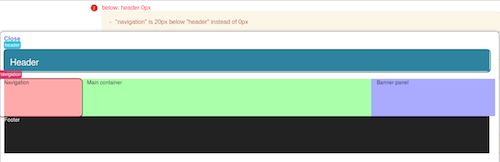
Originally in our specification file, we stated that the navigation panel should be below: header 0px, meaning that it should not have any margin from the top. But in the screenshot we clearly see the gap between header and middle section. Again, that is a bug, and we have to fix it.
Phase 4: Fixing The Failed Tests
I have already prepared a fix for it in the GitHub repository with the v0.1.1 tag Also with the fix, I decided to make the tests give better reports by naming the specification sections.
Let’s first fix our shopping-cart.html. Here is the changed body element:
          Navigation


          Main container


          Banner panel
And now let’s update the main.css file:
#header {
  background: #2E849E;
  color: white;
  border-radius: 0;
}

.navbar {
  margin-bottom: 0;
}

#navigation {
  background: #faa;
}

#main-container {
  background: #afa;
}

#banner-panel {
  background: #aaf;
}

.container-full {
  margin 0 auto;
  width: 100%;
}

.row {
  margin: 0;
}

#footer {
  color: white;
  background: #222;
  height: 100px
}
And below is the change to the homepage.spec file. Here I’ve defined proper names for the sections. Now reading the test will be easier. Also, once we get a test report, it will be properly structured, which will make it easier to understand the feedback.
=====================================
header          css #header
navigation      css #navigation
main            css #main-container
banner-panel    css #banner-panel
footer          css #footer
=====================================

@ Header | *
--------------------
header
  inside: screen 0px top left right
  height: 50px

@ Navigation | *
-------------------
navigation
  inside: screen 0px left
   below: header 0px

@^| desktop
-----------------------
navigation
  width: 200 to 350px
  aligned horizontally all: main
  near: main 0px left

@^| tablet
-----------------
navigation
  inside: screen 0px left right
  above: main 0px
  % height: 50 to 100px

@^| mobile
----------------------
navigation
  inside: screen 0px left right
  above: main 0px
  % height: > 60px

@ Footer | *
-------------------
footer
  % inside: screen 0px bottom left right
  below: banner-panel 0px
  height: 100px

@ Main | desktop
-----------------------
main, banner-panel
  below: header 0px

@^| tablet
----------
main
  inside: screen 0px left
  below: navigation 0px

@^| mobile
------------------
main
  inside: screen 0px left right
  above: banner-panel 0px

Let’s first fix our shopping-cart.html. Here is the changed body element:
Notice the way we are defining our sections and tags now? The pipe symbol tells Galen to use the first part as a name of a section, while the second part (after the pipe) will be used for tag notation. Also, that weird syntax @^| tablet means that Galen should reuse the name from the previous section. We need this to be able to use a different tag for some objects in the same section. And because we don’t want to type the same section’s name multiple times, we can just use the ^ symbol.
Another interesting feature is in this specification file. You may have noticed the % symbol in front of some checks. This tells Galen to ignore the failure and report it as a warning. I’ve declared this symbol for some checks because at the moment there is no content in the navigation, main or banner-panel sections. Once we add some content there, these warnings will go away and we can remove the symbol later.
Now that we have the fix, let’s run our tests again. Remember the command we used the first time? Don’t forget to use your own path on your local machine.
galen test shoppingcart.test \
-DwebsiteUrl="file:///home/ishubin/workspace/workshop-shopping-cart/website/shopping-cart.html" \
--htmlreport reports
On my machine, all of the tests passed.
And here is the detailed report now that we have improved the naming of sections.
Now we can move on to the next iteration.
Phase 5.10: Finish The Project
Delivering a responsive page from my original sketch took me around 10 iterations. I won’t go over all of these iterations here because the process was the same: test, code, refactor. But you can track all of the progress on the workshop overview page. You can also view the shopping-cart page that I came up with in the end.
Of course, it still has some minor bugs in other browsers; I ran Galen tests only in Firefox. So, configuring the tests initially for real mobile devices along with all major desktop browsers might be a good idea. But the purpose of the experiment was just to try TDD for front-end development. That is why I didn’t focus on extensive cross-browser testing — although, to be honest, I think I should have. And if I had configured the website to be accessible from my Android phone and tablet, I could have used Appium with Galen Framework to test the layout.
Summary
It was an interesting experience. The way I worked in the past was to develop a website in one browser and then later hack it to work the same in other browsers. Fixing all of those nasty layout issues is really hard when you have a large HTML and CSS code base and a lot of third-party libraries — and especially if the website is supposed to be responsive. But applying TDD to front-end development helps a lot. It forces me to structure my code and my work process, and to focus on small things and deliver them at high quality.
In the end, I get complete test coverage, which I can use for all regression testing. At some point, I might change some fonts, modify the layout of certain components or add some elements to the page. If something goes wrong, Galen will alert me right away. I encourage you to try this approach, too. It might help you in your website development.
Resources
Further Reading
(da, ml, al, il, mrn)