You’ve seen them before. Confusing and frustrating design patterns that seem to be chasing you everywhere you go, from one website to another. Perhaps it’s a disabled submit button that never communicates what’s actually wrong, or tooltips that — once opened — cover the input field just when you need to correct a mistake. They are everywhere, and they are annoying, often tossing us from one dead-end to another, in something that seems like a well-orchestrated and poorly designed mousetrap.
These patterns aren’t malicious nor evil. They don’t have much in common with deceptive cookie prompts or mysterious CAPTCHAs in disguise of fire hydrants and crosswalks. They aren’t designed with poor intentions or harm in mind either: nobody wakes up in the morning hoping to increase bounce rates or decrease conversion.
It’s just that over the years, some more-or-less random design decisions have become widely accepted and adopted, and hence they are repeated over and over again — often without being questioned or validated by data or usability testing. They’ve become established design patterns. And often quite poor ones. Showing up again and again and again among user complaints during testing.
In this new series of articles, let’s take a closer look at some of these frustrating design patterns and explore better alternatives, along with plenty of examples and questions to keep in mind when building or designing one. These insights are coming from user research and usability tests conducted by yours truly and colleagues in the community, and of course, they all will be referenced in each of the upcoming posts.
We’ll start with a humble and seemingly harmless pattern that we all had experienced at some point — the infamous birthday picker that too often happens to be inaccessible, slow and cumbersome to use.
We’ve written about perfect date and time pickers in much detail already, but birthday pickers deserve a separate conversation.
Every time you apply for a job application, open a bank account or book a flight, you probably will have to type in your date of birth. Obviously, the input is a date, and so it shouldn’t be very surprising to see interfaces using a well-adopted date-picker-calendar-alike widget (native or custom), or a drop-down to ask for that specific input.
We can probably spot the reasons why these options are often preferred. From the technical standpoint, we want to ensure that the input is correct, and catch errors early. Our validation has to be bulletproof enough to validate the input, provide a clear error message and explain what exactly the customer needs to do to fix it. We just don’t have all these issues with a dropdown or a calendar widget. Plus, we can easily prevent any locale or formatting differences by providing only the options that would fit the bill.
It might seem that the best way to prevent mistakes from happening is to design a UI in a way that mistakes will be difficult to do. That could mean being strict and explicit in form design — basically allowing only for well-formed input. After all, providing an ill-formed input is impossible if all available choices are well-formed. But while the input indeed will be well-formed, it doesn’t have to be accurate, especially if providing that input is tiring and frustrating.
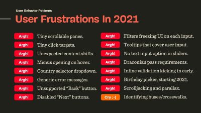
In practice, we actually make similar mistakes with over-complicated and rigorous password requirements, too. It’s not uncommon to see people get so annoyed by these requirements that they put passwords on a sticky note on their screen, or hide them in a personal.txt file on their desktop, just to be able to re-type them if needed. Corporate Wi-Fi passwords and a complex SuperPIN for online banking are good examples of that in action.
It turns out that people are very creative at bending the rules in their favor, so when a system isn’t usable, it’s not secure; and when a form input isn’t usable, the data we receive is going to be less accurate and lead to more errors. Ultimately, it of course would lead to situations when users are locked out and are forced to abandon the UI as they can’t make any progress.
There is a flip side to that coin as well. We could of course eliminate all complexity and always provide a single input field, allowing users to type whatever they prefer. In practice that means that they actually will type whatever they prefer, often in a poorly structured and inefficient way.
In the case of a birthday input, in usability tests, customers type in anything from July to Jul to 06 to 6, often with random delimeters and a few typos along the way, and with a mixed order of days, months and years. Validating that input after submit doesn’t serve users well because they don’t know what input formatting would work. Obviously it doesn’t serve our needs well either.
With our design, we need to provide a respectful, straightforward guidance, along with an accessible technical implementation. This brings us to some common downsides of native date pickers and dropdowns.
The Pitfalls of Native Date Pickers and Dropdowns
Unfortunately, native date pickers, prompted by , come along with plenty of accessibility nightmares. At the moment of writing, when used out-of-the-box, they aren’t a very accessible choice for pretty much any kind of date input. Not only are there plenty of screen reader issues, but also focus and layout issues, confusing and generic error messages.
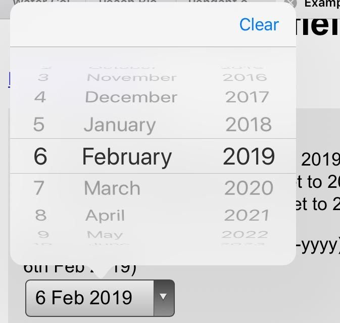
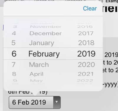
I’ve seen a good number of implementations disabling keyboard input altogether (see above), requiring customers to use native date picker’s calendar widget exclusively. And this is painfully, painfully slow. Without a keyboard input fallback, users have to embark on a long-winded journey between days, months and years, taking up dozens and dozens of taps or clicks.
While we know the date immediately, the interface prompts us to navigate between dates, and then find our date in the monthly overview once we get there. That’s the reason why these experiences are frustrating.
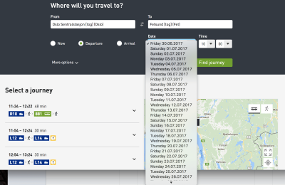
In that light, drop-downs are much faster and easier to navigate. They are accessible by default, plus rather than navigating between months and years, it’s enough to locate the right numbers in 3 lists — days, months and years. But drop-downs are still slow. They have zooming issues. Pinching scrollable options is tiring. They take up a lot of space. The list of years is long. And when specifying the input, we need to tap the control, then scroll (usually more than once), find and select the target, and continue to the next dropdown. It’s not exhilarating either.
So it’s not uncommon to see dropdowns considered the UI of last resort, and usually replaced with buttons (e.g. for filters), toggles, segmented controls, or autocomplete boxes that combine the flexibility of a text box with the assurance of a -box. Dropdowns aren’t bad per se; it’s just users spend way more time than necessary filling in the data in them.
And then there is a question about default values. While with dropdowns we often default to no input whatsoever (mm/dd/yyyy), with a date picker we need to provide some starting point for the calendar view. In the latter case, ironically, the “starting” date usually happens to be just around the date of when the form is filled, e.g. May 15th, 2021. This doesn’t appear optimal of course, but what should be the right date? We need to start somewhere, right?
Well, there really isn’t a right date though. We could start early or late, 3 months ago or tomorrow, but in the case of a birthday picker, all of these options are pure guesswork. And as such, they are somewhat frustrating: without any input, customers might need to scroll all the way from 1901 to the late 1980s, and with some input set, they’ll need to correct it, often jumping decades back and forth. That interaction will require impeccable precision in scrolling.
No matter what choice we make, we will be wrong almost all the time. This is likely to be different for a hotel booking website, or a food delivery service, and plenty of other use cases — just not birthday input. This brings us to the conversation about how to objectively evaluate how well-designed a form input is.
Evaluating The Quality Of Form Design
Design can be seen as a very subjective matter. After all, everybody seems to have their own opinion and preferences about the right approach for a given problem. But unlike any kind of self-expression or art, design is supposed to solve a problem. The question, then, is how well a particular design solves a particular problem. The more unambiguous the rendering of designer’s intent, the fewer mistakes customers make, the less they are interrupted, the better the design. These attributes are measurable and objective.
In my own experience, forms are the most difficult aspect of user experience. There are so many difficult facets from microcopy and form layout to inline validation and error messages. Getting forms right often requires surfacing back-end errors and third-party errors properly to the front-end and simplifying a complex underlying structure into a set of predictable and reasonable form fields. This can easily become a frustrating nightmare in complex legacy applications and third-party integrations.
So, when it comes to form design, in our projects, we always try to measure the quality of a particular solution based on the following 9 attributes:
- Mental model
How well does our form design fit into the mental model of the customer? When asking for personal details, we need to ask exactly the minimum of what’s required for us to help our customers get started. We shouldn’t ask for any sensitive or personal details (gender, birthday, phone number) unless we have a good reason for it, and explain it in the UI. - Complexity
How many input elements do we display per page, on mobile and on desktop? If a form contains 70–80 input fields, rather than displaying them all on one page, or use a multi-column layout, it might be a good idea to use a task list pattern to break down complexity into smaller, manageable chunks. - Speed of input
How much time and effort does the customer need to fill in data correctly? For a given input, how many taps/keystrokes/operations are required to complete the form with a given data accurately, assuming that no mistakes are done along the way. - Accessibility
When speaking about the speed of input, we need to ensure that we support various modes of interaction, primarily screen reader users and keyboard users. This means properly set labels, large buttons, labels placed above the input field, and errors properly communicated, among many other things. - Scalability
If we ever needed to translate the UI to another language or adapt it for another form factor, how straightforward would it be, and how many issues will it cause? (A typical example of a problematic solution is a floating label pattern, and we’ll talk about it in a separate post.) - Severity of interruptions
How often do we interrupt customers, be it with loading spinners, early or late inline validation, freezing parts of the UI to adjust the interface based on provided UI (e.g. once a country is selected), the frequency of wrongly pre-filled data, or wrongly auto-corrected data? - Form success rate
How many customers successfully complete a form without a single mistake? If a form is well designed, a vast majority of customers shouldn’t ever see any errors at all. For example, this requires that we tap into browser’s auto-fill, the tab order is logical and making edits is conventional and obvious. - Speed of recovery
How high is the ratio of customers who succeed in discovering the error, fixing it, and moving along to the next step of the form? We need to track how often error messages appear, and what error messages are most common. That’s also why it’s often a good idea to drop by customer support and check with them first what customers often complain about. - Form failure rate
How many customers abandon the form? This usually happens not only because of the form’s complexity, but also because customers can’t find a way to fix an error due to aggressive validators or disabled “submit” buttons. It also happen happens because the form asks too much sensitive and personal information without a good reason.
To understand how well a form works, we run usability studies with customers accessing the interface on their own machine — be it mobile device, tablet, laptop or desktop — on their own OS, in their own browser. We ask to record the screen, if possible, and use a thinking-aloud protocol, to follow where and how and why mistakes happen. We also study how fast the customer is moving from one form field to another, when they pause and think, and when most mistakes happen.
Obviously, the sheer number of taps or clicks doesn’t always suggest that the input has been straightforward or cumbersome. But some modes of input might be more likely to generate errors or cause confusion, and others might be outliers, requiring just way more time compared to other options. That’s what we are looking for in tests.
Now, let’s see how we can apply it to the birthday input problem.
Designing A Better Birthday Input
If somebody asks you for your birthday, you probably will have a particular string of digits in mind. It might be ordered in dd/mm/yyyy or mm/dd/yyyy, but it will be a string of 8 digits that you’ve been repeating in all kinds of documents since a very young age.
We can tap into this simple model of what a birthday input is with a simple, single-input field which would combine all three inputs — day, month, and year. That would mean that the user would just type a string of 8 numbers, staying on the keyboard all the time.
However, this approach brings up a few issues:
- we need to support auto-formatting and masking,
- we need to explain the position of the day/month input,
- we need to support the behavior of the
Backspacebutton across the input, - we need to track and hide/show/permanently display the masking,
- we need to support jumps into a specific value (e.g. month),
- we need to minimize rage clicks and navigation within the input to change a specific value on mobile devices,
- If auto-making isn’t used, we need to come up with a set of clean-up and validation rules to support any kind of delimiters.
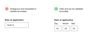
In his book on Form Design Patterns, Adam Silver argues that using multiple inputs instead of one input is rarely a good idea, but it is a good option for dates. We can clearly communicate what each input represents, and we can highlight the specific input with focus styles. Also, validation is much easier, and we can communicate easily what specific part of the input seems to be invalid, and how to fix it.
We could either automatically transition the user from one input to the next when the input is finished, or allow users to move between fields on their own. At the first glance, the former seems better as the input would require just 8 digits, typed one after another. However, when people fix errors, they often need input buffers — space within the input field to correct existing input.
For example, it’s common to see people typing in 01, realizing that they made a mistake, then changing the input to 010, and then removing the first 0, just to end up with a reversed (and correct) string — 10. By avoiding an automatic transition from one field to the next, we might be causing less trouble and making the just UI a bit more predictable and easy to deal with.
To explain the input, we’d need to provide labels for the day, month and year, and perhaps also show an example of the correct input. The labels shouldn’t be floating labels but could live comfortably above the input field, along with any hints or examples that we might want to display. Plus, every input could be highlighted on focus as well.
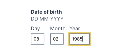
Over the years, I couldn’t spot a single problem with this solution throughout years of testing, and it’s not surprising the pattern being used on Gov.uk as well.
When You Need A Date Picker After All
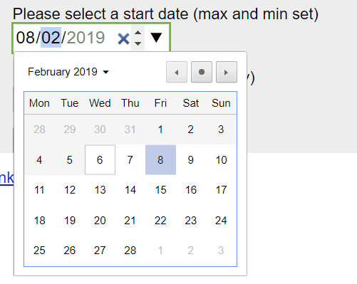
While the solution above is probably more than enough for a birthday input, it might not be good enough for more general situations. We might need a date input that’s less literal than a birth day, where customers will have to pick a day rather than provide it (e.g. “first Saturday in July”). For this case, we could enhance the three input fields with a calendar widget that users could use as well. A default input would depend on either the current date, or a future date that most customers tend to choose.
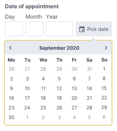 code example for the Memorable date pattern in his
Adam provides a simple code example for the Memorable date pattern in his NoStyle Design System. It solves plenty of development work and avoids plenty of accessibility issues, and all of that by avoiding tapping around calendar widgets or unnecessary scrolling around dropdown wheels.
Wrapping Up
Of course, a good form control depends on the kind of date input that we are expecting. For trip planners, where we expect customers to select a date of arrival, a flexible input with a calendar look-up might be useful.
When we ask our customers about their date of birth though, we are asking for a very specific date — a very specific string, referring to an exact day, month, and year. In that case, a drop-down is unnecessary. Neither is a calendar look-up, defaulting to a more-or-less random value. If you do need one, avoid native date pickers and native drop-downs if possible and use an accessible custom solution instead. And rely on three simple input fields, with labels and explanations placed above the input field.
We’ve also published a lengthy opus on designing a perfect date and time picker, along with checklists you might want to use to design or build one.
Related Articles
If you find this article useful, here’s an overview of similar articles we’ve published over the years — and a few more are coming your way.
Further Reading
(il, mrn)