
role=“checkbox”.
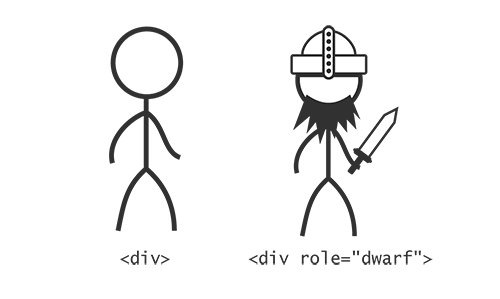
Roles in ARIA, like races in a role-playing game, are a part of a character’s identity that we might be interested in. We might expect dwarves to be strong and good at constructing machines, just like we expect a to have the characteristics and behaviors already discussed. By putting role=“button” on an element that isn’t actually a , we are asking assistive technologies to identify it as a button, evoking those characteristics.
Properties
Character sheets with just names and races would be a bit limited. We’d probably be a bit uncomfortable with so much emphasis on race, too. The whole point of ARIA is that it recognizes elements not just for their generic, reductive classification. Much better to identify characters and elements by their individual assets and talents.
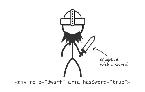
A typical sheet would list a set of characteristics for a character that, in one way or another, the game identifies as having a certain currency and importance. For instance, you might be an elf but one who is special for the ability to cast certain magic spells. In much the same way, we looked at an element that is made special for having the property of a submenu. This would be identified to the accessibility layer, just like the basic role, via the aria-haspopup=“true” property attribute.
A huge number of properties have been specified and documented. Some are global, meaning that any element may have them, while others are reserved for particular contexts and elements. Dwarves are usually precluded from having good longbow accuracy, whereas the skill is common to elves. The aria-label that we would use to label a button is global, whereas aria-required, which denotes a required user entry, would normally be used in form fields or elements with form-field roles, such as listbox and textbox.
States
Perhaps the most important distinction between a static web document and an application is that the elements in an application tend to change — sometimes dramatically — according to user interaction and timed events. Depending on what’s happening in an application at any one time, the elements therein could be said to be in certain, often temporary, states.
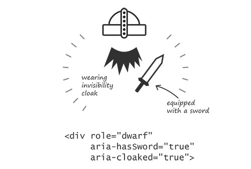
In role-playing games, you have to keep tabs on the state of your character: How healthy are you? What items have you collected? Who have you befriended? This is all scribbled down, erased and scribbled down some more on the character sheet. Keeping track of the state of interactive elements is important for accessibility, too.
In your application, the state of an element is usually represented visually. In role-playing games and in screen-reader buffers, this is not the case: It has to be imagined. If your dwarf character has donned their magic cloak of invisibility, you’d probably want to write this down on the character sheet so that you remember. Similarly, writing the aria-hidden attribute on an element ensures that the accessible state of invisibility is recorded properly.
States such as aria-expanded are announced according to a value of true or false. An item with aria-expanded=“false” is announced by JAWS and NVDA Windows screen readers as “collapsed.” If — or, rather, when — it is set to aria-expanded=“true”, then the item will be announced as “expanded.”
It’s about time we put everything we’ve learned about roles, properties and states into practice and build our first ARIA widget.
The term “widget” is often used in JavaScript development to denote a singular pocket of script-enabled interactive functionality. Mercifully, the ARIA definition corresponds, and ARIA widgets can be thought of as JavaScript widgets that have been made accessible with appropriate ARIA attributes.
Let’s make a simple toolbar — a group of button controls that enable us to organize some content. In this case, we’ll set up controls to sort content alphabetically and reverse alphabetically. Fortunately, we have access to the W3C’s guide on authoring ARIA widgets, “General Steps for Building an Accessible Widget With WAI-ARIA,” which covers a similar example for a toolbar.
The Toolbar Role
There’s no such thing as a toolbar role in our toolbar’s parent element. This marks the scope of the widget:
/* toolbar functionality goes here */
(Note: A
type of toolbar, but it has not been adopted by browser vendors so is unable to provide the information we need.)
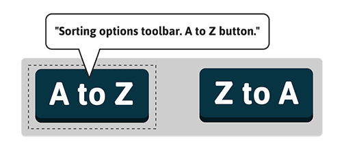
The toolbar’s purpose in our design should be obvious from its visual relationship to the content it affects. This won’t communicate anything aurally, however, so we should provide an accessible name for our toolbar via the now familiar aria-label property. That’s one role and one property so far.
/* toolbar functionality goes here */
Now let’s add the buttons that will be our controls.
Even without the additional widget properties and states, we’ve already improved the user’s recognition of the toolbar: Using the NVDA screen reader or the JAWS screen reader with Firefox, when a user focuses the first button, they are informed that they’re inside a toolbar and — thanks to the aria-label — told what it is for.
The Relationship
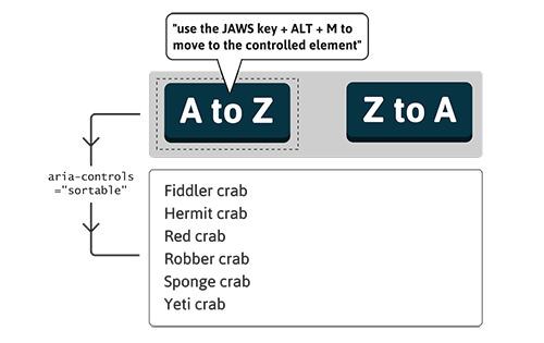
So far, we haven’t actually connected our toolbar to the content it controls. We need a relationship attribute, which is a special kind of property attribute that communicates a relationship between elements. Our widget is used to control the content, to manipulate and reorganize it, so we’ll go with aria-controls. We’ll join the dots using an id value, just as we did in the earlier example of the popup menu.
- Fiddler crab
- Hermit crab
- Red crab
- Robber crab
- Sponge crab
- Yeti crab
Note that we’ve added aria-controls to the toolbar itself, not to each individual button. Both would be acceptable, but using it just the once is more succinct, and the buttons should each be considered individual components that belong to the controlling toolbar. If we want to check which properties and states are supported for widget roles like toolbar, the specification provides a list of “inherited states and properties” in each case. Consult this when you build a widget. As you will see, aria-controls is an inherited property of toolbar.
Some screen readers do very little explicitly with this relationship of information, while others are quite outspoken. JAWS actually announces a keyboard command to enable the user to move focus to the controlled element: “Use JAWS key + Alt + M to move to controlled element.” Once you’ve affected it, you might want to go and inspect it, and JAWS is helping you to do just that here.
Pressed And Unpressed
Depending on which sorting option is our current preference, we could say that the button that commands that option is in a “selected,” or “pressed,” state. This is where the aria-pressed state attribute comes in, taking a value of true for pressed or false for unpressed. States are dynamic and should be toggled with JavaScript. On the page being loaded, just the first button will be set to true.
- Fiddler crab
- Hermit crab
- Red crab
- Robber crab
- Sponge crab
- Yeti crab
Pairing the styles for active (:active) buttons with the styles for aria-pressed buttons is a good practice. Both are buttons that have been “pushed down,” whether momentarily or semi-permanently.
button:active, button[aria-pressed="true"] {
  position: relative;
  top: 3px; /* 3px drop */
  box-shadow: 0 1px 0 #222; /* less by 3px */
}
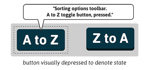
When the user focuses a button with aria-pressed present using either NVDA or JAWS with Firefox, the button is identified as a “toggle button.” Using the latest version of JAWS and focusing a button with aria-pressed=“true” will append the word “pressed” to the announcement accordingly. In the ChromeVox screen reader for the Chrome browser, an aria-pressed=“true” button is announced as “button pressed” and aria-pressed=“false” as “button not pressed.” To a greater or lesser extent, most modern browsers and screen readers articulate helpful information about the state or potential state of these buttons.
Keyboard Controls
Not quite there yet. For toolbars — as with many ARIA widgets — the W3C recommends certain keyboard navigation features, often to emulate the equivalent in desktop software. Pressing the left and right arrow keys should switch focus between the buttons, and pressing “Tab” should move focus out of the toolbar. We’ll add tabindex=“-1” to the list and focus it using JavaScript whenever the user presses “Tab.” We do this to allow users to move directly to the list once they’ve chosen a sorting option. In a toolbar with several buttons, this could potentially save them from having to tab through a number of adjacent buttons to get to the list.
- Fiddler crab
- Hermit crab
- Red crab
- Robber crab
- Sponge crab
- Yeti crab
$(listToSort).focus();
All Done
That concludes our ARIA widget. A live demo is ready for you to play with and test. Remember that it’s not really about sorting, per se — that’s all done with JavaScript. The aim is to make explicit the relationships and states of our application, so that whatever we are doing to our content — sorting it, editing it, searching it, creating it, recreating it — our users on keyboards and screen readers are kept in the loop.
The next chapter of the Apps For All: Coding Accessible Web Applications eBook puts the application functionality to one side and addresses how to actually find that application functionality in the first place. Mobility is a big part of accessibility online and off, so it’s important to look at different ways to help our users get around.
Further Reading
(al, il, mrn)